
On this page:
Case Study 1 – Restructuring reporting at Sport England
Case Study 2 – Designing tools at Centre for Public Digital Services
Case Study 1 – Restructuring Reporting
The context
Sport England work with partners to get everyone to enjoy the benefits of physical activity.
A change in strategy meant changing how they worked with partners. I was part of the team working on delivering the strategy – to make working with partners more consistent, more efficient and more effective.
This example covers just some of the work we did.
The problem
In feedback sourced around from across the organisation, reporting had been raised by partners as a specific pain point. Partners described it as a ‘burden’ and they were unclear what Sport England needed from them.
As a result partners were writing thousands of words trying to ‘cover all the bases’ in the hope that they would tell Sport England what they needed to hear.
This meant that the volume of information coming into Sport England colleagues was overwhelming and they were unable to efficiently and effectively understand how partners were making a difference with the funding from Sport England.
OUR AIM: Changing what partners report
Our goal was to improve the reporting process to make it less of a burden partners and easier for Sport England to understand process.
We needed to design a consistent way for all 137 partners to talk about their work. Working as a team we decided that shifting from reporting against individual goals to reporting against a framework known as theory of change would provide that consistency.
My role in the work
I look on the task of designing how we used the theory of change framework effectively. I needed to:
- make the framework accessible to the broad range of partners
- simplify the language to make it easy to understand
- bring clarity to what what Sport England wanted from partners
Where I started
I dived into the user feedback we had to try and get a better understanding of reporting from a partner perspective. I also reviewed the existing information that was available to partners about the framework.
I noticed that engagement with the new framework seemed to be limited. Not many attendees to events and not may views of related content.
Armed with some knowledge, I ran a session with two of the subject matter experts to get a better understanding of the elements of the framework and why they were important. I used it as an opportunity for clarity and collaboration.
I then created a version of each element simplifying the content to make it easier to understand while also creating a clear distinction between each one.
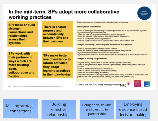
At the top in the yellow was what we started with. The four blue post it’s underneath was how I was able to simply all that information.
I shared this in another session with the subject matter experts to get their feedback. This led to further tweaks.
Testing the idea
To make sure we were on the right track we designed a way to test our belief that what we had now was easy to understand and made it clear what needed to be reported.
I did this by creating what we imagined would be in the system in a Word document. We sent it to the research six partners and asked them to fill it out using bullet points for each section, asking them to spend no more than 15 minutes on the task.
Together with the service designer, I developed a user research discussion guide that gave us the opportunity to learn about reporting from the partner perspective. I wanted to get more specific around the pain points, as well as get feedback on the prototype.

From the research we learned that:
- knowledge of the framework was inconsistent
- there was a wide variation in the capacity available to complete reporting in the organisations
- there is a keenness to get this ‘right’ from partners
- there is a keenness to get this ‘right’ from partners
From the framework /prototype task we learned that:
- word count was a concern
- more clarity was needed to help them to focus what they told us
- word count was a concern
I used this information to create a final version. I focused my efforts on a ‘what good looks like’ section which was designed to add more clarity.
Outcomes
By the reporting deadline, all the organisations who had submitted their reporting had completed this new section. This suggested that I had succeeded in making it easy to understand and accessible to all the partners.
We had hoped to make the process less of a burden for partners. Feedback suggested that although partners found it hard they could see why we’d done it. And they could more easily see what Sport England needed from reporting.
Embedding the framework into reporting meant we delivered a more consistent and effective way to understand progress across all 137 partners.
And in designing the questions I also helped to future-proof the reporting system. It is now designed in a way to allow the team to change the questions in line with the changing priorities of the organisation if necessary.
Case Study 2: Designing tools for teams
The context
The Digital Service Standard for Wales was published in March 2022. Work was happening on a service manual to help teams meet the standards. In late 2025 the team I was working with at the Centre for Digital Public Services (CDPS) had an ambition to scale the service assessment offer, getting more teams take part and getting more experts to join the assessment panel.
The problem
Our first round of research uncovered a fundamental stumbling block – that teams did not know how to embed the Digital Service Standard for Wales into their ways of working. The service assessment is based on this standard so if teams weren’t working to the Standard why would they want to be assessed against it?
In this example, we looked at how we might address this barrier so that we could move closer to ambition to increase the number of service assessments across Wales.
OUR AIM: Find ways to encourage teams to use the Standard
Based on insights from the first experiment we thought that embedding the Standard into key points in the design cycle would be easy way get teams familiar with the requirements.
We mapped the cycle and then designed some tools that could work alongside the service manual.
My role in the work
I led the design of the tools we created to test as part of the alpha. I was responsible for:
- using my content design skills to create checklist questions from the Digital Service Standard
- creating an initial checklist prototype in Miro
- designing a higher fidelity checklist prototype in Figma
- designing a sample checklist outcome report and created it in Figma
- mocking up a web page in the CDPS style
- writing the research guide in collaboration with the rest of the team
- leading the user research sessions with participants from across Wales
- analysing and sharing insights from the research
Clip from our Show & Tell of me explaining what we did
The Outcomes
This piece of work demonstrated that a checklist could be used to help teams to:
- raise awareness of best practice
- get a shared understanding of how to work
- shape project direction
- measure quality consistently
- communicate quality to leaders
It was something that could be used by teams to help embed the Digital Service Standard. This work became a key part of our overall recommendations for how the service assessment offer from CDPS could scale.
You can read more in this blog post about shaping the future of service assessments on the CDPS website.
